Onboarding: the framework
and the redesign
First I built the playbook that gave every team a shared language for onboarding decisions. Then I used it to redesign a failing device out-of-box experience from scratch, and the model traveled across the entire org.
Choose Your Own Adventure
Proposed a ground-up onboarding redesign close to a major milestone. Met with resistance. Made the case. It worked.
A turf war in
the onboarding flow.
Before the redesign, there was a framework problem. Every feature team — health, notifications, messaging, camera — wanted their product included in the first-time setup flow. The onboarding experience was bloating because nobody had a framework for deciding what belongs in setup vs. what belongs later.
Experience teams and the platform team were in constant conflict about what should be mandatory, what should be optional, and what should happen after setup entirely. Without a decision framework, every conversation became a negotiation rather than a prioritization.
The root problem: "onboarding" meant different things to different teams. Some meant the first 5 minutes, others meant the first week. There was no shared vocabulary. So I built one.
Three phases.
One shared language.
The playbook's core contribution was a three-phase model that gave every team the same vocabulary for onboarding decisions. Before it existed, "onboarding" meant the first 5 minutes to some teams and the first 30 days to others. The framework made that ambiguity impossible.
Will your product make the device work? → Yes
Is this a hard requirement (legal / privacy / consent)? → Yes → Mandatory setup
Is this a general enhancement? → Yes → Optional setup
Does it help someone personalize their device? → Yes → Tutorials / Tooltips
Could this product wait to be found organically? → Yes → Tutorials / Tooltips
Is legal or privacy part of the requirement? → Yes → Permanent education
"She developed the new user experience (NUX) playbook and helped establish the mandatory and optional framework, which has been immensely valuable in anchoring content from various experience teams."
— Product manager"Aligning on a shared language is already proving really useful."
— Product manager"Your leadership in all the new user experience work and also all the content magic in all our projects have been a crazy amount of help."
— Product designerThen I had to
use the framework.
The NUX Playbook gave teams a shared language. But Device 1's out-of-box experience was still failing. The UX KPI score sat at 3.6 — moderate launch risk. Leads kept saying it was too long. The assumption was that the number of screens was the problem.
But we weren't allowed to remove screens. Every PM owned a piece of the out-of-box experience and wanted their feature in setup. So the team was stuck: too long, can't cut, no plan.
My hypothesis was different. It wasn't the number of screens — it was the number of clicks, the rigid linear sequence, and the feeling that you weren't making progress. The narrative was wrong. The architecture was wrong. The fix wasn't cutting screens. It was reorganizing them.
When words didn't work,
I built it in FigJam.
I'd been working on Device 1's out-of-box experience with two PDs. We kept getting the same feedback from leads: too long. But we couldn't remove screens. I had a hypothesis — it wasn't the screen count, it was the click count and the narrative momentum — but I couldn't get the PDs to engage with the idea through conversation alone.
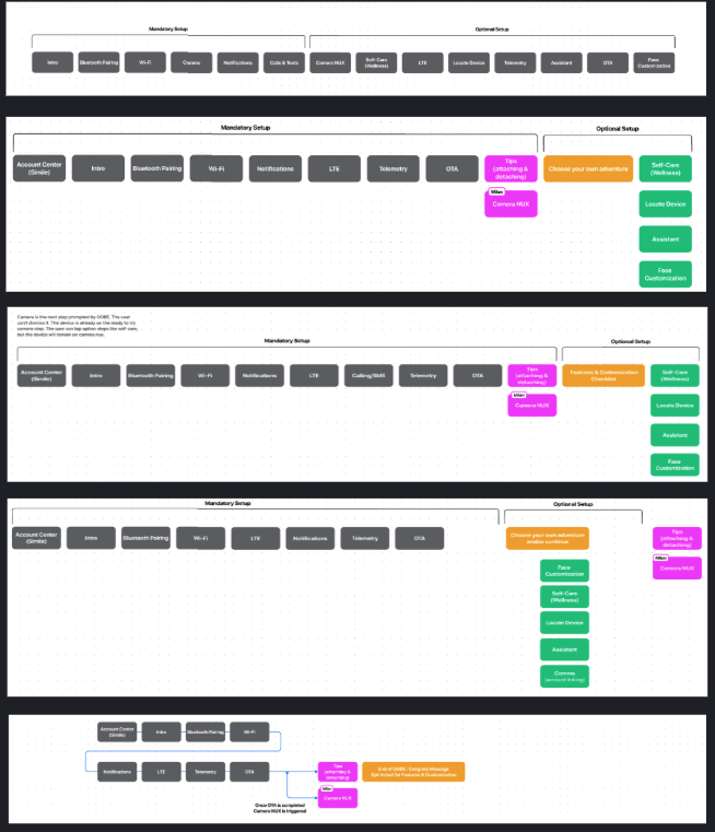
So I stopped arguing and started showing. I opened FigJam and built out every possible way to reorganize the same screens: different groupings, different sequences, different splits between what was mandatory and what was optional. Just colored squares. No polish. The point was to make the options visible so we could evaluate them together instead of debating abstractions.
The PDs came around. We collaborated on a version we all had a hand in, and took two variants through UX research.
The underlying concept — mandatory vs. optional out-of-box experience sections — had roots in a conversation I'd had with a previous product design who'd since left the team. We'd called it CHOOBE: choose your own out-of-box experience. The idea was that every team's feature could be included in setup, but not all of them had to be completed by the user. Teams got what they wanted; users got optionality. That's the architecture the CYOA model was built on.
The FigJam that
changed the conversation.
Four flow variants, mapped in a shared FigJam. Each row shows a different way to reorganize the same screens — splitting mandatory setup from optional configuration, reordering features, testing different grouping strategies. No polish. The point was to make the options visible so the team could evaluate them without defending the status quo.
When the FigJam worked,
we ran a workshop.
Once the PDs were on board with the concept, we needed to make the case more rigorously — without formal UX research, because we didn't have time. So we ran a structured workshop grounded in jobs to be done and requirements-focused thinking. The goal was to establish shared principles for what belonged in out-of-box experience and what didn't, and to build a framework we could use to defend every decision to engineering and leadership.
Start with why someone
buys the device.
We anchored the workshop in the product's "Reasons to Buy/Wear" framework — four jobs the device was hired to do. These became the filter for every out-of-box experience decision: if a screen didn't directly support one of these jobs, it was a candidate for removal or deferral. We also established "Principles for Drawing a Line" — three questions any team could use to evaluate whether their feature belonged in mandatory setup.
- Does this directly support one of the four reasons to buy or wear the device?
- Does shipping it now enable a reason to buy or wear for a future generation product?
- Could we ship without it and people could still accomplish the four core jobs?
Map the experience
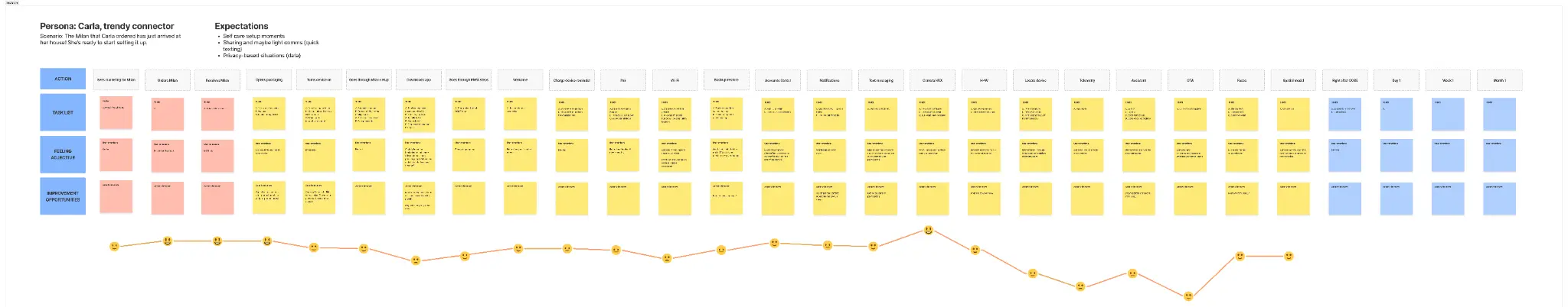
through Carla's eyes.
We built a journey map for Carla — a "trendy connector" persona — walking her through every step of the out-of-box experience from unboxing to first use. For each step, we documented the task list, her feelings, and the improvement opportunities. The emotion curve at the bottom made visible what the screen count had obscured: the experience had too many low points in the middle, right when users needed momentum.
The golden path of
a-ha moments.
We mapped the "golden path" — the sequence of moments where users would first feel the device was worth it. These didn't have to happen in order, but they had to happen. The wave diagram made the argument: out-of-box experience should be designed around getting users to their first a-ha moment as fast as possible, not around completing a checklist of feature introductions.
Three principles.
One shared framework.
The workshop produced three new user experience principles that became the shared language for every out-of-box experience decision going forward. These weren't just documentation — they were the criteria we used to evaluate the revised flow with engineering and to make the case that we could ship without formal UX research.
From colored squares
to a real architecture.
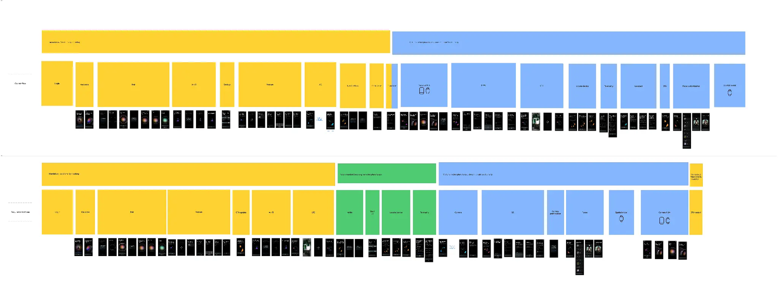
The workshop produced a set of revised flow variants — no longer just colored squares, but a structured architecture with clear mandatory and optional sections, color-coded by category. The before/after comparison shows how the flow changed: a flat sequence of screens became a tiered system where the mandatory path is short and the optional path is genuinely optional.
When a team wanted in,
I held the line.
Once the mandatory/optional framework was established, teams had to agree to it — including teams whose features didn't fit the definition. The framework was clear: mandatory setup included only what was necessary for the device to function, or what was a hard requirement from Legal, Privacy, or Consent. Everything else was optional.
One team pushed back. They wanted their feature in mandatory setup. Their argument: their feature was important enough to warrant it. The counter-argument: every team thinks their feature is important enough. That's the whole reason the framework exists.
I held the line. The framework wasn't a suggestion — it was the architecture that made the CYOA model work. If mandatory setup expanded every time a team made a case for their feature, it would collapse back into the same bloated linear flow we'd just fixed. The framework survived. The feature went into optional setup. The model held.
The model that
traveled across products.
The CHOOBE architecture — mandatory setup separated from optional configuration, with a modular "get more from your device" screen — was adopted across every device in the org. Below are six versions of that screen across different products. The pattern is the same: a clean list of optional setup tasks, each self-contained, each skippable. The content adapts to the device. The architecture doesn't change.
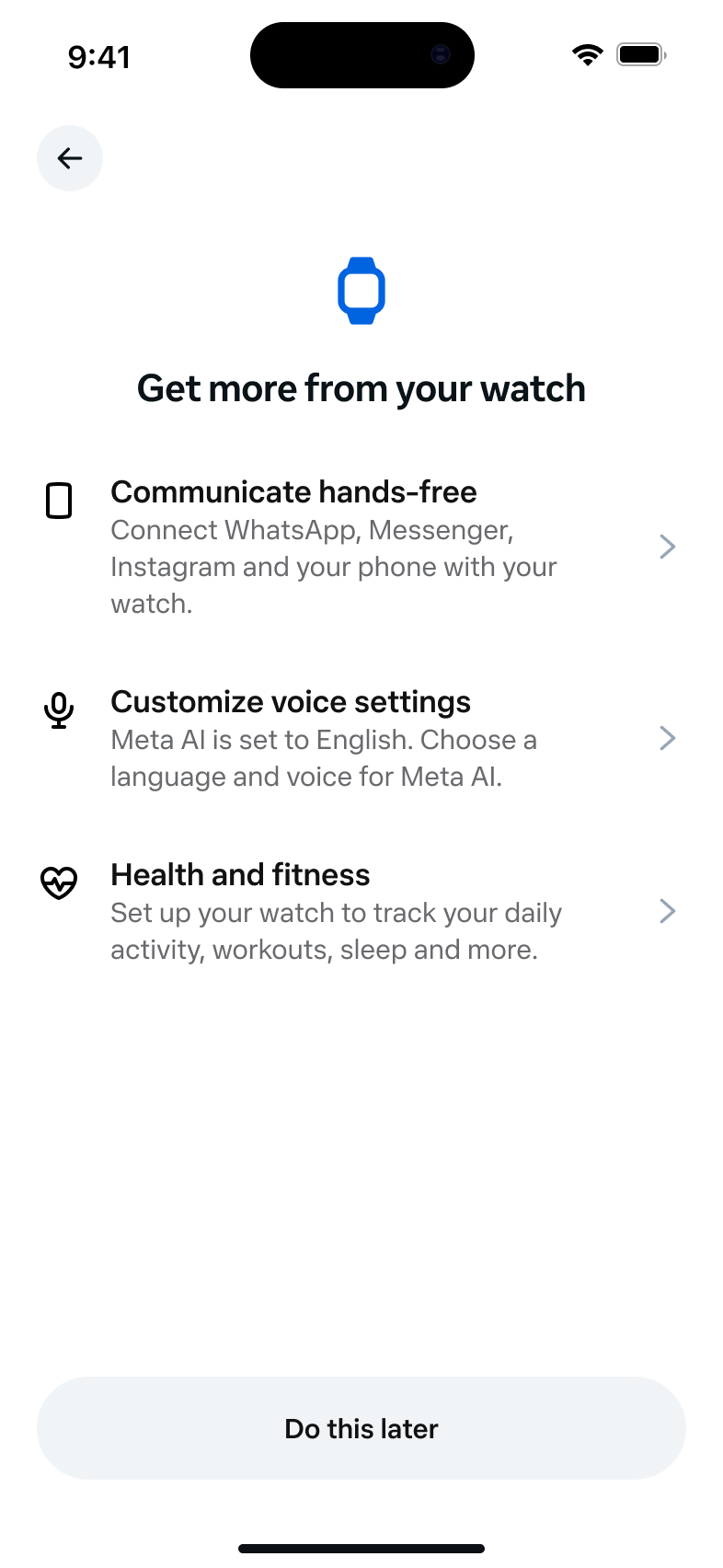
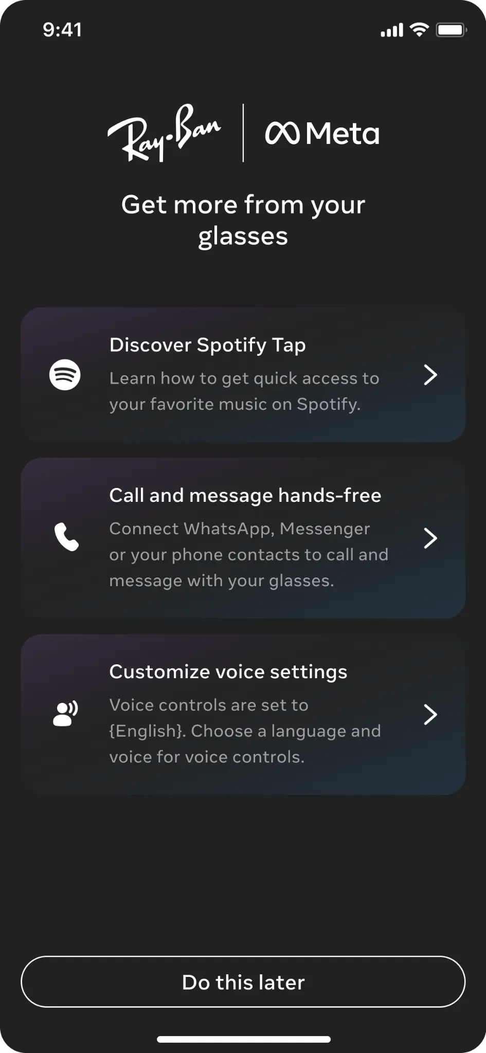
![Device 1 CHOOBE screen: 'Make [device] your own' with five optional setup tasks including watch face picker, health apps, accounts, AI, and Locate Device](../assets/choobe-milan-original.png)
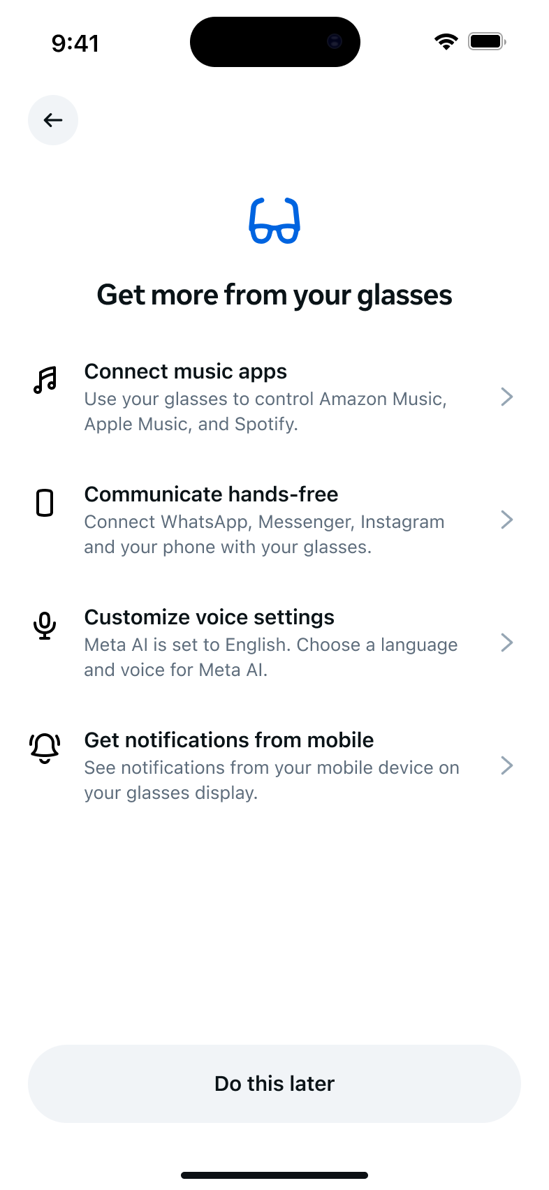
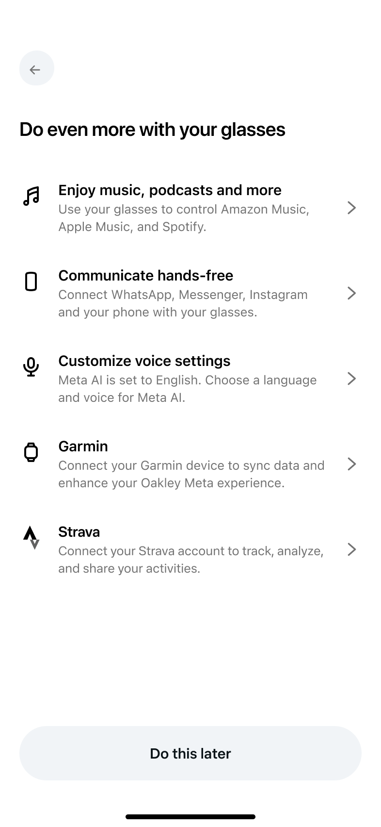
Screens I wrote: Device 1. Screens shown for context (same architecture, different products): Displayless glasses and AI glasses (Christina Choi), AI sport glasses (Shiva Best). The architecture originated with Device 1's work and was adopted org-wide.
Just say no to
"Are you sure?"
The CYOA work surfaced a broader pattern problem: teams were using double-confirmation dialogs throughout the out-of-box experience. These go against general UX best practices — especially in permissions and consent flows where interrupting momentum erodes trust. I wrote an org-wide guideline to eliminate them, audited every module, and set a deadline for the one team that hadn't complied.
The OOBE Design team has an updated guideline: OOBE doesn't support double confirmations in the flow.
“Are you sure?” dialogs go against general UX best practices. We recommend communicating what’s needed upfront and letting people move forward, uninterrupted, regardless of their choice. For privacy permissions and commitments, this is especially important.
Three years later,
same rigor, new device.
In 2025, I applied the same audit methodology to the Device 1's out-of-box experience — a 70+ item content audit covering every screen from power-on through the product tour. The audit used a four-category issue taxonomy: missing (content entirely absent), accuracy (incorrect or outdated content), consistency (terminology or tone varies without reason), and quality (content could be clearer or better tailored to the surface).
The audit surfaced patterns that went beyond individual screens: codename accuracy issues throughout, permissions and consent flows that needed privacy team alignment, a product tour that didn't reflect the device's positioning as a companion product, and an etiquette screen that had been carried over from glasses without being reconsidered for the wrist context.
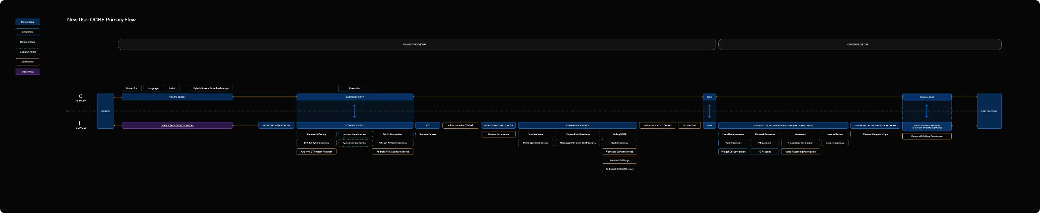
Modular onboarding.
Self-contained modules.
A modular onboarding architecture that separated mandatory setup from optional configuration — so users could get to the watch faster without skipping anything critical.
A content framework that gave each setup module its own self-contained narrative — so users could enter any module without needing context from previous screens.
A revised permissions flow that combined, relocated, and removed permissions to reduce friction — validated with Legal, PXFN, and engineering before every change.
The concept outlasted
every product it started in.
The UX KPI score improved from 3.6 to 3.9 — moving the experience from "moderate risk" to "borderline acceptable for launch." In the context of a product close to feature complete, that's significant movement.
But the bigger outcome is the adoption arc. The CYOA model was first adopted for Ray-Ban Stories out-of-box experience prototype. Then Ray-Ban Meta glasses. Then it became the default architecture across all device OOBEs in the org. The mandatory/optional split I co-developed is still in every device out-of-box experience today.
Dogfooding feedback from 6 of 9 testers on Device 1 preferred the CYOA prototype. They cited brevity and optionality. They said it got them to the watch sooner. That was the whole point.
"Your work to redesign out-of-box experience was an uphill climb that involved persuading your cross-functional team to consider and implement a significant overhaul of the flow close to a major launch milestone. It was viewed as risky and met with reluctance — but you made a compelling case for it by using competitive audits and wireframing the design concept."
— Manager review"Your ‘Choose Your Own Adventure’ concept was also adopted for the Ray-Ban Stories out-of-box experience prototype, which dogfooding feedback suggested was a clear improvement over the Ray-Ban Stories out-of-box experience due to its brevity and optionality."
— Manager review"Ashlee continued to be crucial in completing the design of Device 1's out-of-box experience, landing the CYOA design change, and shipping both for Gen 1 and 2."
— Product design peerI almost didn't
propose it.
A peer noted in my review that I wasn't sure this was "a battle worth having." They were right. I hesitated. The concept only traveled because I eventually committed to the pitch — but I lost time second-guessing myself first.
The lesson: if you've done the research and the data supports the change, trust your judgment earlier. Stop framing good work as a "bad first draft" to make it feel safer to share. And when words aren't working, build something. The FigJam squares did more in one session than weeks of conversation had.