Settings: from junk drawer
to trust surface
The industry treats settings like a junk drawer. Every feature team adds their own, nobody owns the whole, and users can't find what they need. I owned settings for Meta's wearables ecosystem — and I built the content infrastructure to treat it like the trust surface it actually is.
Settings is the surface every team touches and nobody owns. It's not glamorous. It doesn't get roadmap time. Features get added to it without a content designer in the room. I was the first on this product to claim it — and treat it like the experience it actually is.
Nobody owned settings.
So I did.
Meta's wearables companion app had 80+ settings screens. Every feature team had added their own — different label conventions, different description styles, different categorization logic. The result was a junk drawer: a surface nobody had designed, only added to.
Research told us users had three core problems with settings: they couldn't find what they were looking for (findability), they were overwhelmed by the volume of options (customization), and they didn't understand what the defaults meant or why they existed (guidance). These aren't cosmetic problems. Settings is where personalization, trust, and power-user behavior all converge — and for a product with cameras, microphones, and location tracking, it's also where users go to understand and control what the device is doing on their behalf.
As the device portfolio expanded to include Meta Ray-Ban Display and wrist wearables, the problem was only going to compound: ~135 settings, unclear which device is being adjusted, no clear owner, no standards, no governance. I became the content lead for settings. Not because someone assigned it — because I saw what was happening and built the case to fix it.
The simplification project.
UXR-backed, deadline-driven.
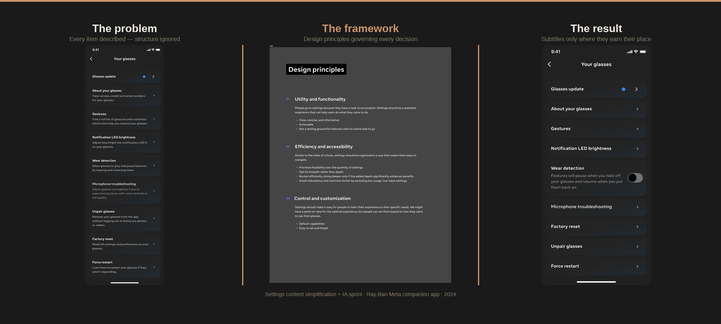
UX research provided the Device Customization and Support team with a heuristic evaluation of the settings experience. The findings confirmed what dogfooding had been surfacing: users were struggling to find privacy and data information, confusing similar-sounding categories, and couldn't tell which device they were adjusting in multi-device scenarios.
My job was to triage the recommendations — not just implement them, but decide which ones were Day 0, which were fast follows, and which weren't worth the engineering cost. That required understanding the research deeply enough to push back when the instinctive response was wrong.
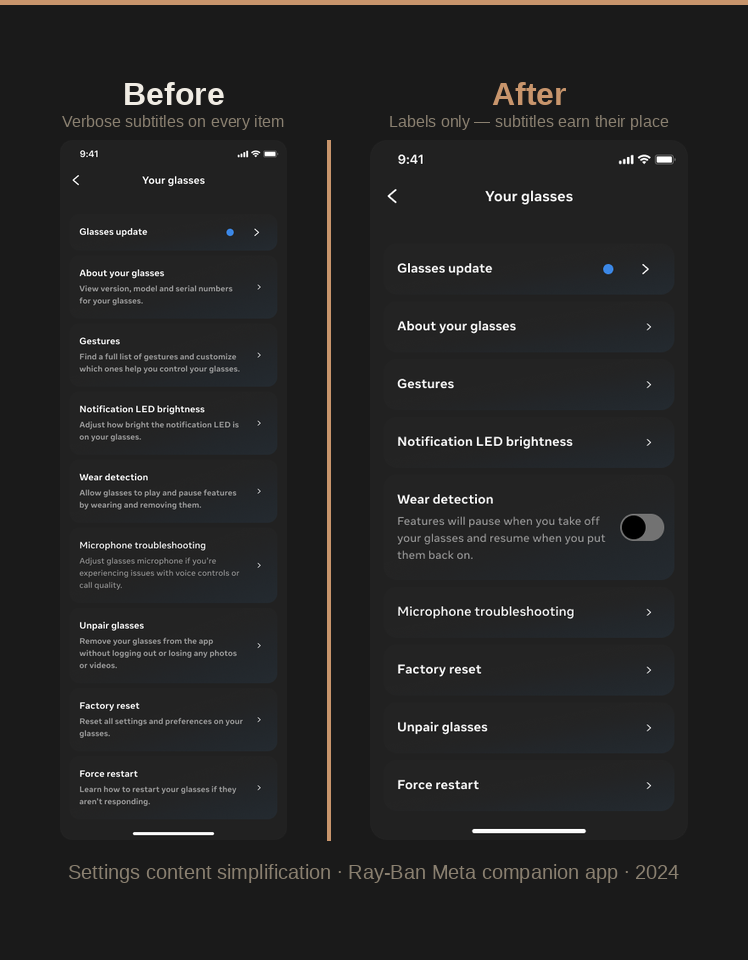
The instinctive response was to add more descriptions. More text to explain what each setting does. I pushed back. The data pointed somewhere else: the problem wasn't that users didn't understand individual settings. It was that they couldn't find them. The problem was structural.
Recent UXR feedback highlighted navigation challenges users face. While there's been discussion about reintroducing descriptions to help with user understanding, a closer look suggests the main issues may lie with information architecture and labeling rather than the need for additional explanations.
- Camera + Gallery → Media, moved to Experiences
- Audio moved to Experiences
- Cross-link from Communication to Connected Apps
- Redundant entry point for Help & Support from Device settings
- Visual inconsistencies corrected between Device and App settings
- Further iteration on categorization and labeling
- Removing redundancies (e.g., Wi-Fi)
- Contextual shortcuts to settings from other parts of the app
- Prioritizing high-engagement settings in the hierarchy
Two days in New York.
Four IA directions for the future.
The simplification project fixed the immediate problems. But as the device portfolio expanded — Meta Ray-Ban Display, wrist wearables, third-party partnerships — the underlying architecture wasn't going to scale. The question wasn't just "how do we fix settings now?" It was "how do we build settings that can handle five devices, global vs. device-level management, and a growing list of third-party integrations?"
I co-led a two-day Settings IA sprint in New York with the Settings design team. I drove the content, IA, and language work — the frameworks, the vision and principles, the settings standards. Over two days, we stress-tested the existing architecture against multi-device scenarios, ran a card-sorting exercise to understand how users bucket settings across device, global, app, and category, and designed four IA directions to test in rolling research.
- Prepare Settings to support multiple wearable devices (multiple wearable device types) and third-party partnerships
- Reorganize Settings IA, stress-testing global vs. device-level management
- Understand the role of device controls within Settings
- Identify pattern improvements
- 4 IA directions designed and debated
- 3 device management directions for UXR testing
- Rolling research kicked off Nov. 6
- Settings standards and governance formalized as a next step
The language standard.
44 strings. One source of truth.
The IA sprint surfaced a recurring problem: teams were referencing Settings inconsistently in product copy. "App settings," "Meta AI settings," "your phone's settings," "go to the Settings app" — all of these appeared in shipped strings, none of them were correct, and none of them matched what users actually saw in the product.
I wrote the Settings language standard and published it to the Wearables Content Design Standards hub in Dim Sum. Four rules, each resolving a specific recurring debate. Then I updated 44 strings across the app and Meta Ray-Ban Display to reflect the new standard — 39 in the app, 5 on Meta Ray-Ban Display — before Day 0 branch cut.
Applying the framework
to a new form factor.
When the wrist wearables entered the picture, the settings architecture had to adapt. Not every setting lives on the wrist — only the ones you'd want quick access to. Whatever appears on both surfaces must stay consistent in terminology and IA with the companion app.
I mapped the full settings landscape across the wrist wearable and the companion app — identifying which settings existed in both, which were wrist-only, which were app-only, and which were in the IA but not yet in Figma. I ran the May 2025 quality cleanup ahead of Day 0 branch cut: coordinating across every feature team to review their settings in the shared Figma file, check accuracy against the latest build, and file bugs for anything that needed fixing.
Most settings live in the companion app. Wrist surfaces only the ones you'd want quick access to on your wrist. Whatever appears on both must stay consistent in terminology and IA.
| Setting | Wrist | App |
|---|---|---|
| General | ✓ | ✓ |
| Meta AI | ✓ | ✓ |
| Gestures | ✓ | ✓ |
| Health & wellness | ✓ | ✓ |
| Sounds & haptics | ✓ | ✓ |
| Storage & backup | — | ✓ |
| Communication | — | ✓ |
| Passcode | ✓ | — |
A surface that scales.
Infrastructure that runs without me.
The simplification project produced a 9-percentage-point improvement in task success (73% → 82%) and a 0.5-second reduction in mean time on task — both validated by UXR click testing. Settings categorization was adopted as the standard across two product lines. The "Shared settings" concept for multi-device management simplified navigation and reduced engineering complexity.
The IA sprint produced four tested directions and a roadmap for scaling Settings across five devices. The language standard resolved four recurring debates and updated 44 strings before branch cut. The cross-device mapping gave every feature team a clear picture of where their settings lived and what consistency meant across surfaces.
The governance model — the Settings playbook, the office hours, the ownership model — means teams can add new settings consistently without a content designer in the room. That's the point. Settings isn't a junk drawer anymore. It's a system.
Content decisions validated by UXR click testing. Every change iterated based on where users actually got stuck — not where we assumed they would. Mean time on task dropped from 6.2 to 5.7 seconds.
Settings playbook, language standards in Dim Sum, cross-device mapping, and office hours — so any team adding a new setting can do it consistently without content design involvement.
The IA sprint produced four directions tested in rolling UXR research — stress-testing global vs. device-level management across AI glasses and wrist wearables. Shaped settings architecture for 3+ products.