Content design lead on an
unreleased wrist wearable
Meta's first wrist wearable had dozens of engineers, multiple PMs, and a full design team. It had one content designer. I built the systems that made that sustainable — and shipped with zero content blockers at code freeze.
One Content Designer. One Entire Product.
Every surface, every flow, every cross-functional negotiation — running through a single person.
One content designer.
An entire product.
When I joined the wrist wearable team as the sole content designer, the product was already in motion. There were 10+ product managers, a full design team, engineering squads across multiple surfaces, and a launch timeline with real stakes. There was no content playbook. No terminology standard. No process for how content decisions got made, reviewed, or communicated.
The role wasn't just "write the UI copy." It was: figure out what content infrastructure this product needs to ship well, build it, and do it fast enough to actually matter.
I was promoted to Staff mid-cycle during this work, after earning a "Significantly Above Expectations" rating — the only person on my team to receive that rating in that cycle.
"Your documentation serves as a gold standard for cross-functional partners, effectively reducing churn and empowering Product Design and Engineering to move faster."
— Najwa Smith, Manager, H2 2025The infrastructure model
I approached the role as a systems problem, not a writing problem. The question wasn't "what copy does this screen need?" — it was "what systems does this team need to make good content decisions at scale, with or without me in the room?"
150+ deliverables across the product
The 150+ deliverables weren't just UI copy. They were the full content infrastructure of a product — from first-run experience to error states, from health data displays to payment flows.
Task success: 73% → 82%
Content decisions weren't made on instinct — they were validated. I partnered with UX research to run usability studies on key flows, using task success rates as the primary metric for content effectiveness.
The 73% → 82% improvement in task success rates across tested flows wasn't a coincidence. It was the result of iterating on copy based on where users got stuck, not where we assumed they would.
I also used the research findings to build the case for content changes that required cross-functional alignment — translating user behavior data into the language of product risk.
The structural challenges
Being the sole content designer on a product this complex isn't just a workload problem — it's a structural one. Every content decision was also a cross-functional negotiation. Every UI copy item had a PM who owned it, an engineer who implemented it, a Legal partner who reviewed it, and a localization team who had to translate it.
The absence of a playbook was the hardest part. There was no prior art for how content should work on a wrist wearable at Meta. I was writing the rules while also executing against them — which meant every governance decision I made had to be defensible, documented, and durable enough to survive my absence.
I also had to manage the political complexity of a product with 10+ PMs, each with their own surface priorities and launch pressures. Getting alignment on a single terminology decision sometimes meant three rounds of stakeholder review. I built the process to make that sustainable.
"Ashlee is the sole content designer on a product that has the complexity of an entire operating system. She has built the systems, the standards, and the relationships that make that sustainable."
— Peer review, H1 2025Zero content blockers at code freeze
Code freeze is the moment in hardware development when the software is locked for manufacturing. Any unresolved content issues at that point become a product risk. We hit code freeze with zero content blockers — every UI copy item reviewed, every terminology decision documented, every edge case resolved.
That outcome wasn't luck. It was the result of building the infrastructure early enough that the team could operate it without me needing to be in every room. The standards hub, the terminology governance, the office hours — all of it was designed to make "zero blockers" the default, not the exception.
The game plan
When I stepped into the Content Design Single-Threaded Leader role for the wrist wearable, I wrote a game plan that documented every active workstream, every risk, and every gap — not as a status update, but as a strategic operating document. This is a condensed version of that plan.
Wrist wearable: Content Design game plan
Weekly updates as a leadership practice
One of the structural challenges of being the sole content designer on a product this complex is that your work is invisible by default. Engineers don't see the terminology decisions. PMs don't see the standards work. Leadership doesn't see the cross-functional alignment happening in the background.
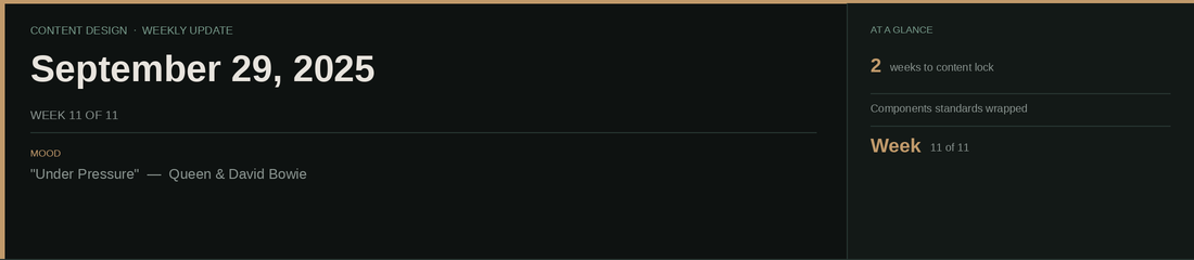
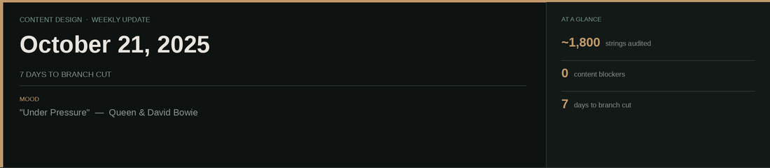
I solved this with a weekly update post — a digest I published every week to the product team on Workplace. Not a status report. A communication artifact: synthesizing what happened, what was decided, what was coming, and what the risks were. Eleven consecutive weeks. Every week, on time.
This is what Staff-level communication looks like in practice.

- Completed listening tour across 7 cross-functional partners — engineering, product, Product Marketing, UX research, and design leads
- Identified key risks: no shared terminology system, no content owner for cross-device UX, OOBE scope still undefined
- Launched weekly update cadence to surface progress and decisions asynchronously
- Got a device — first time experiencing the product as a user
- Collaborated with eng and PM leads on short-term permissions strategy; drafted recommendations post
- Drafted error message standards: tone, structure, categories, and do’s/don’ts based on prior audit
- Completed listening tour — confirmed coverage across PM, PD, PMM, and UXR leads
- Shared the official product name with CDs — a milestone that had been months in the making
- Delivered a voice & tone presentation at the Wearables OOBE sprint
- Escalated permissions gaps with PM and PD leads to drive teams to address them before content lock
- Wrapped content standards for components; building the reusable permissions/consents template
- Working on codename replacement framework — when to use “device,” “watch,” default name, or product name
- PDs heads down on demo flows; demo reviews in progress up the leadership chain
- Posted date/time/timestamp standard to the wrist wearable designers group to align all instances before cut
- Tracking terminology flags: product name attribution in flows, voice notes (not voice memos), widgets vs. live activities, TTS strings referencing wrong device type
- Content decisions log now includes every decision made — what, why, and supporting context. If you're asking “What did Ashlee do?” — the answer's probably there.
- Began audit of ~1,800 string instances to identify device-type updates needed post-cut
These are internal Workplace posts, shared weekly with the wrist wearable product team. Internal product names have been removed. 11 consecutive posts, July–October 2025.
Term briefs: governing the vocabulary of a new product
When a product doesn't have shared language, every team invents their own. I wrote term briefs for the most contested and consequential terms on the wrist wearable — documenting the recommended term, the reasoning, the context, and the rules for use. These aren't style guide entries. They're governance decisions with rationale.
Activity panel
Live activity indicator
Panel widget
"Ashlee's work has stepped up both the quality and coverage of our Design System. I really admire her ability to identify areas of opportunity and develop frameworks around them: that's the systematic thinking that's gonna make our system one of the strongest in the entire company."
— Scott Gary, Product Design Lead, AI Wearables